How Silicon Valley Startups Can Design Dashboards Stakeholders Understand and Actually Use


Introduction
Silicon Valley startups often build dashboards for people who are short on time and high on accountability. Founders, product leads, growth teams, and investors do not need more charts. They need fast clarity on what is happening, why it matters, and what needs attention right now.
Quick Answer
Silicon Valley startups can design dashboards and reporting views that busy stakeholders actually use by narrowing each dashboard to a clear job, choosing only the metrics tied to decisions, organizing information in a simple visual hierarchy, and showing trends and context instead of isolated numbers. The best dashboards feel easy in under a minute, answer obvious follow-up questions without clutter, and separate high-level stakeholder views from deeper operator views so decision-makers get clarity without getting buried in detail.
1. Start with the decision, not the dashboard
A dashboard is useful only when it helps someone decide what to do next. Many startup dashboards fail because they are built around available data instead of stakeholder decisions.
Before designing anything, ask:
- Who is this dashboard for?
- What decision do they need to make from it?
- How often will they check it?
- What would make them trust it?
- What action should happen if a metric changes?
A board-facing dashboard, for example, is usually about growth, efficiency, risk, and trend direction. A product leadership dashboard may need to show activation, retention, feature adoption, and friction points. A RevOps or growth dashboard may need more channel-level visibility and funnel movement.
If one view is trying to serve all of those audiences at once, it usually becomes noisy and underused.
A simple startup rule
Use this test early: if a stakeholder cannot explain the dashboard’s purpose in one sentence, the dashboard is probably trying to do too much.
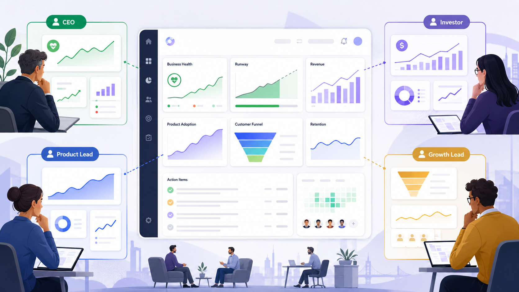
2. Separate stakeholder dashboards from operator dashboards
One of the most common mistakes Bay Area startups make is giving executives the same view operators use every day.
Busy stakeholders usually want:
- Top-line performance
- Trend direction
- Exceptions or risks
- Comparisons against targets
- A short path to explanation
Operators usually want:
- Granular detail
- Filters
- Drill-down paths
- Row-level or segment-level data
- More frequent updates
Both are valid. They just should not live in the same default view.
A practical split
Create two layers:
Executive or stakeholder view
This should answer:
- Are we on track?
- What changed?
- Where is the biggest issue or opportunity?
- What needs discussion?
Working or analysis view
This should answer:
- What caused the change?
- Which segments are driving it?
- Where exactly is the problem?
- What should the team test or fix?
This structure helps leaders stay engaged because they are not forced to decode an operator interface just to understand business health.
3. Choose fewer metrics and define them clearly
A dashboard becomes harder to use every time a startup adds another metric that does not clearly support a decision.
For most stakeholder dashboards, fewer metrics usually works better than more. The goal is not to display everything that can be measured. The goal is to display what matters most.
A strong metric set usually has:
- A business outcome metric
- A few supporting operational metrics
- A target or benchmark
- A comparison point such as last week, last month, or last quarter
- A clear definition everyone agrees on
For a B2B SaaS startup, that might look like:
- Pipeline created
- Sales-qualified opportunities
- Win rate
- Expansion revenue
- Retention trend
For a product dashboard, that might look like:
- Activation rate
- Weekly active users
- Feature adoption
- Time to value
- Retention by cohort
Good metric selection questions
Ask these before locking the dashboard:
- Does this metric help someone decide something?
- Can a non-operator understand it quickly?
- Is it stable enough to trust?
- Do we already have a shared definition for it?
- Would removing it actually hurt the dashboard?
If the answer to the last question is no, the metric may not belong in the main view.
4. Design the layout for fast scanning
Busy stakeholders rarely read dashboards from top to bottom in a careful sequence. They scan. Good dashboard design respects that behavior.
A useful structure usually looks like this:
Top row: the state of the business
Use a small set of core KPIs that answer the highest-level question quickly.
Examples:
- Revenue
- Activation
- Retention
- Conversion rate
- Burn multiple
- NPS or customer health score
Middle section: trend and movement
Show what is changing over time, not just static totals.
Useful patterns:
- Line charts for trends
- Bar charts for comparisons
- Small variance indicators against target
- Short annotations for major changes
Lower section: supporting context
This is where stakeholders can get more explanation without being overloaded too early.
Useful content:
- Segment comparisons
- Funnel breakdowns
- Channel performance
- Region or customer-type splits
- A short note on what changed
A strong visual hierarchy usually includes
- The most important numbers first
- Clear labels in plain language
- White space between sections
- Consistent chart behavior
- Limited color emphasis used only for meaning
- One obvious reading path
If every card looks equally important, the dashboard usually feels harder to read than it should.
5. Make reporting views answer the next question naturally
A stakeholder sees a number and almost immediately asks a follow-up question. Good reporting views anticipate that.
If a dashboard says conversion dropped, the next question is usually why. If retention improved, the next question is usually where. If a pipeline number is off target, the next question is usually which segment or motion is responsible.
That means reporting views should not stop at summary. They should support a natural second layer of understanding.
A practical sequence
A strong reporting flow often moves like this:
- Summary metric
- Trend over time
- Breakdown by meaningful segment
- Short explanation or annotation
- Link to deeper analysis if needed
For example, if a board dashboard shows a drop in activation, the reporting view might immediately show:
- Activation trend over the last 12 weeks
- Breakdown by signup source
- Breakdown by company size
- Breakdown by onboarding step completion
- A note explaining a product or acquisition change that affected the trend
This helps busy stakeholders stay engaged because they do not have to ask three separate people for the basic context behind every number.
6. Use plain language, not internal jargon
A lot of startup dashboards are harder than they need to be because they reflect internal team language instead of stakeholder language.
A founder may know what "PQL to SAL velocity" means. A new board member may not. A product lead may know what "WAU/MAU stickiness" means, but a cross-functional stakeholder might need clearer framing.
Use labels that make the meaning obvious.
Instead of:
- PQL velocity delta
- Funnel completion variance
- Net active account health
Use:
- Time from qualified lead to sales meeting
- Onboarding completion rate
- Healthy active customer accounts
This does not mean oversimplifying the business. It means reducing translation effort.
A good rule for labels
If a smart stakeholder outside the operating team would need verbal explanation to read the metric correctly, the label probably needs work.
7. Show context, targets, and exceptions
A dashboard without context forces people to interpret numbers in isolation. That usually leads to confusion, overreaction, or long meetings spent aligning on what the numbers even mean.
Busy stakeholders need to know:
- Is this good or bad?
- Is it improving or declining?
- Is it above or below plan?
- Is this normal variability or a real issue?
- What deserves attention first?
That is why strong dashboards include:
- Targets
- Historical comparison
- Thresholds
- Notes for unusual changes
- Clear indicators of priority
For example, a retention rate on its own may not say much. A retention rate compared with last quarter, target, and segment mix says much more.
What to highlight
Do not highlight everything. Highlight only what deserves attention.
Usually that means:
- A metric materially off target
- A meaningful trend shift
- An outlier segment
- A sharp week-over-week or month-over-month change
- A new risk or opportunity
This keeps the dashboard useful because stakeholders learn that emphasis actually means something.
8. Keep filters and drill-downs controlled
More filters do not automatically make a dashboard more useful. For stakeholder reporting, too many controls often create confusion and inconsistent interpretation.
Use only the filters that help answer the most common follow-up questions.
Good examples:
- Date range
- Segment
- Region
- Customer type
- Product line
- Channel
Avoid adding every possible filter just because the data model allows it. That usually turns a reporting view into a self-service BI tool for users who do not want that job.
A practical approach
For stakeholder-facing views:
- Keep the default view strong enough on its own
- Limit filters to the most meaningful dimensions
- Make comparisons easy
- Keep drill-down paths obvious and contained
For analyst or operator views:
- Allow more flexibility
- Support saved views
- Preserve deeper exploration tools
This balance keeps the dashboard approachable while still giving teams a path into detail when needed.
9. Build trust with consistency and data hygiene
A dashboard no one trusts is a dashboard no one uses.
Trust usually breaks when:
- Definitions change without warning
- Numbers do not match across tools
- Charts lag too far behind reality
- Stakeholders find missing or confusing logic
- The same metric appears differently in different places
To make dashboards credible, startups need a few discipline rules:
- Use one source of truth for each key metric
- Keep definitions documented
- Label update frequency clearly
- Standardize date ranges and comparison logic
- Review metrics regularly for accuracy and continued relevance
A useful startup habit
Add a small metric note or info state where necessary:
- What the metric means
- When it updates
- What is included or excluded
That small detail can save a lot of confusion, especially as teams grow and more stakeholders start using the reporting layer.
10. Review usage, not just design quality
A dashboard may look clean and still fail if no one uses it in real decision-making.
After launch, watch for signals like:
- Which sections people actually open
- Which filters they use repeatedly
- Where they stop scrolling
- Which metrics they ask about in meetings anyway
- Which charts generate confusion
- Whether the dashboard gets opened proactively or only when sent around
You can also ask stakeholders directly:
- What part do you check first?
- What feels slow or unclear?
- What question do you still need to ask after reading this?
- What would make you trust this more?
- What can we remove?
The best dashboard teams keep refining. Some Silicon Valley product teams, including Ankord Media in client work that touches product experience, treat dashboards as working interfaces that need iteration, not static reporting artifacts.
11. A simple framework startups can use
If your team needs a practical way to evaluate a dashboard before launch, use this checklist.
The stakeholder dashboard checklist
Clarity
- Can someone understand the purpose in one sentence?
- Are labels plain and specific?
- Is the main takeaway obvious within a minute?
Decision support
- Does each metric support a real decision?
- Does the dashboard show what needs attention?
- Are targets and comparisons visible?
Structure
- Is there a clear visual hierarchy?
- Are the most important metrics placed first?
- Does the view move naturally from summary to explanation?
Usability
- Are filters limited and useful?
- Can a stakeholder get answers without training?
- Is the deeper analysis path available without cluttering the top layer?
Trust
- Are definitions consistent?
- Is update timing clear?
- Would different teams interpret the metrics the same way?
If a dashboard scores weakly in any of these areas, it usually needs simplification before it needs more features.
Final Tips
The dashboards stakeholders actually use are usually the ones that respect attention, reduce translation effort, and make next-step decisions easier. For Silicon Valley startups, that usually means fewer metrics, clearer hierarchy, stronger context, and separate views for executives and operators instead of one crowded reporting layer trying to serve everyone.

Book an Intro Call
Frequently Asked Questions
A startup dashboard should show stakeholders the most important business outcome first, followed by trend direction, target comparison, and the main issue or opportunity that needs attention. For Silicon Valley startups, the best stakeholder dashboards do not begin with every available chart. They begin with the clearest answer to whether the company, product, funnel, or team is on track.
Startups should choose dashboard metrics based on the decisions stakeholders need to make, not simply based on what data is available. A strong stakeholder dashboard usually includes one primary business outcome metric, a few supporting metrics, a target or benchmark, and a clear comparison period such as week over week, month over month, or quarter over quarter.
Stakeholder dashboards and operator dashboards should be separate because executives, investors, product leads, and operators need different levels of detail. Stakeholders usually need top-line performance, risks, exceptions, and trend context, while operators need filters, drill-downs, segment-level data, and deeper analysis tools to understand what caused the change.
A dashboard becomes easier to understand at a glance when it uses a simple visual hierarchy, plain-language labels, consistent chart formats, and limited color emphasis for only the most important signals. The top section should answer what is happening, the middle section should show how performance is changing, and the lower section should explain the context behind the numbers.
Startups can make dashboard reporting more trustworthy by using consistent metric definitions, one source of truth for key numbers, clear update timing, and notes that explain what each metric includes or excludes. Stakeholders are more likely to use a dashboard when the numbers match across tools, the logic is easy to understand, and teams interpret the same metric the same way.